You must have gone through an instance when you clicked on a link or entered a URL, but instead of navigating to the site you want, you faced an error pops up indicating that the requested page is not available. Mostly, they are displayed with the text “404 Not Found”.
A 404 not found error is an HTTP status code which means the page user requested on the website is not found on the website’s server. Although, having too many 404 errors on your e-commerce store can create a negative impression on the search engines like Google or Yahoo, but sometimes a 404 error page is inevitable on your e-commerce store. In this situation, the best way to not deliver a bad user experience is to design a very attractive 404 error page. In this article, we will go through the best 404 error pages that you can take as a reference while designing the 404 error page for your site. But before let’s know more about a 404 error page.
How does a 404 error page trigger?
Generally, a 404 error page is triggered when the content of a website has been removed or moved to another URL. Apart from this, there are certainly other instances by which a 404 error page can be triggered:
- The URL of the page content (like files or images) has been deleted or moved without making changes in internal links.
- Users have typed incorrect URL, or the development team has linked incorrectly, or the URL was written incorrectly during the development phase.
- The server on which the site is hosted is not working properly or the connection is broken.
- Requested domain name can’t be converted to an IP by the DNS
- Entered domain name doesn’t exist anymore.
Importance of Creating a Custom 404 Error Page:
A custom 404 page takes away the confusion of not landing on the page they had intended to land on. The users realize that there is an error with their request. Either they entered an incorrect URL, or the page is not available. An effective 404 page should understand this mistake and guide them to relevant pages.
This gives you an opportunity to place valuable links in front of the users which would have been lost on a default HTTP error page. It is up to you that on which page you redirect the users using that link.
Besides this, a 404 page helps you to monitor your errors. There are tools like Google Analytics, Google Search Console, Google Tag Manager, etc. lets you report and track these 404 errors.
If you track 404 errors using Google Search Console, you will get a report of site errors including 404 error which was spotted by the crawlers of Google. However, it is not necessary that the issues which Googlebot crawlers faced will be viewed by the users.
You can also track 404 errors using Google Analytics reports or also use Google Tag Manager which makes it a more optimal method.
Components of a 404 Error Page:
A valuable 404 error page must have these four components: Navigation, Tone, SEO, and Creativity. Let’s know about each component in detail:
1. Navigation:
Navigation is the main need of a user when lands on a 404 page. You must redirect users to the page where they want to go. Always provide a link to your homepage or any other essential landing page. Providing the navigation of your menu bar ( which is present on the website other pages as well) is also quite helpful. You can also use chatbots to invite lost visitors to find what they are looking for.
2. Tone:
While designing a custom 404 error page, make sure that it follows your brand tone and design. You don’t want users landing on a 404-page feeling that they have navigated to an entirely different website. Keep your overall tone and style consistent.
3. SEO:

You must accept the fact that 404 errors are inevitable. The main reason for a 404 error page is a broken link which is unavoidable. But a 404 page when designed properly can decrease the damage and in fact, convert a negative experience into a positive one. A custom 404 page has following benefits:
- Reducing bounce rate and helps the users to stay on the website
- Keeps the users engaged with your site
- Leave them with a good feeling after resolving the 404 problem
- Maintain consistent branding across the website
4. Creativity:
To show your creativity on a 404 page you can crack a joke, offer some interactivity, display some interesting/cool/fun elements, etc.
Basically, create a 404 error page that is highly customized and regardless of how the user has encountered the 404 pages, they will be entertained before being redirected.
Best Creative 404 Error Pages Examples:
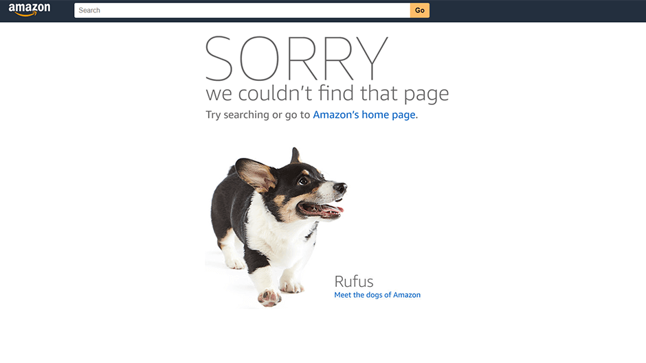
Do you know that more than 7,000 dogs have been registered to work at Amazon’s headquarters? Amazon’s pet-friendly policy is hardly a secret and the company even brags for its dog-friendly culture. It is clearly evident from its 404 error page design.
Although, everyone love dogs but Amazon take it to the next level by displaying the image of an Amazonian’s dog that they brought to work. Also, a user can easily find a link to the homepage and an article about other dogs they have. Users landing on Amazon’s 404 pages can use the search bar right there for exploring the desired products.
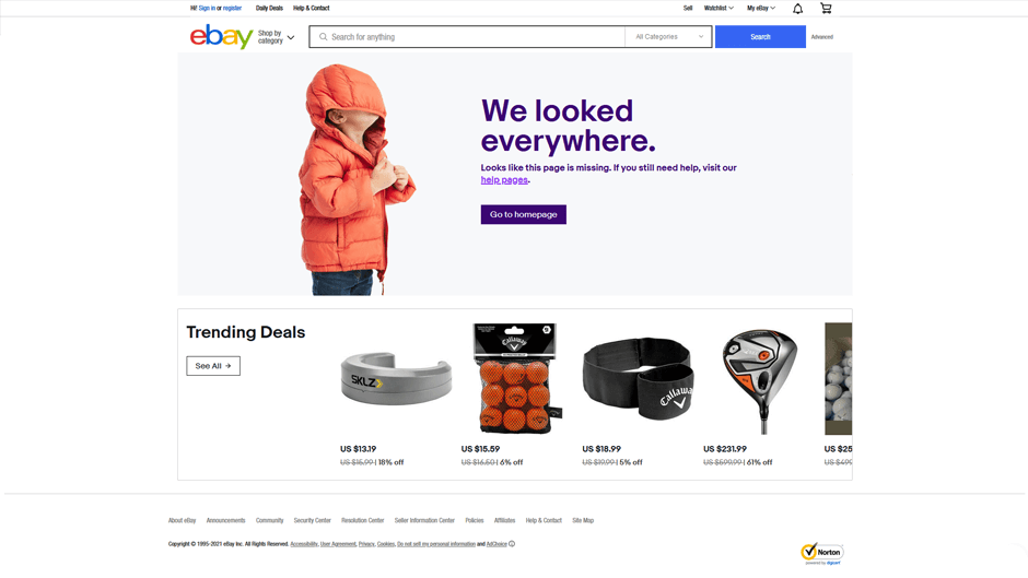
eBay is one of the oldest and largest e-commerce marketplaces for buying and selling goods. They have created a very simple & subtle 404 error page, yet it is user-friendly. The users can check out trending deals on this page which will attract them to check those deals and buy products. Apart from this, there is a search bar and a link redirecting to the home page.
The 404 error page of Ebay is a great example of how to convert customers even on a 404 error page.
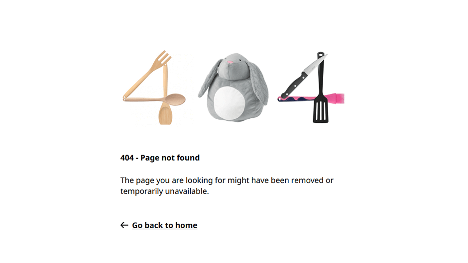
IKEA is a furniture giant which offers a mass range of attribute products. The company is highly innovative in delivering a better shopping experience. The best example is the adoption of Augmented Reality in its mobile app by which the buyers can check how the furnishing items will look in their home.
Similar creativity they have shown while designing their 404 error page. It has deploy elements that emphasize its work and brand. It is paired with a straightforward message and a redirecting link to the homepage. There are no other distractions on the page and the motive is clear – redirect lost customer to the website’s homepage.
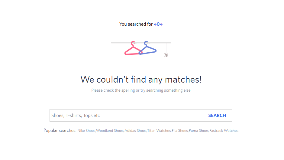
Myntra is a highly popular clothing e-commerce website which comes with a huge range of clothes for users of all age and gender. On its 404 page, they are indicating the user an idea of lost navigation, and at the same time, there is a search bar by which user can find products, and categories pages links. Myntra has equipped its 404 pages with everything that a customer might need, the wishlist, cart page link, profile link, and the search box!
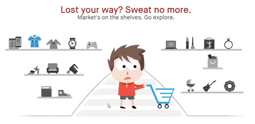
Snapdeal is another big name in the e-commerce industry. The company has shown its best level of creativity on the 404 error page. It comes with a little which caught users’ attention in seconds. The rolling eyes in the cursor direction is a funny thing to watch. Besides this fun, the shelves are neatly arranged with the related links.
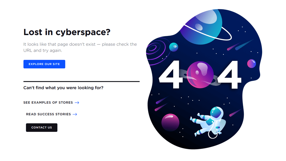
BigCommerce is a very popular name in the e-commerce industry. It is an e-commerce platform just like Magento. On its 404 pages, the users can easily understand that they have lost in cyberspace. They have specifically pointed out the pages that they want the users to land on apart from the homepage.
They have also given the functionality of booking a demo or contact them from the 404 error page.
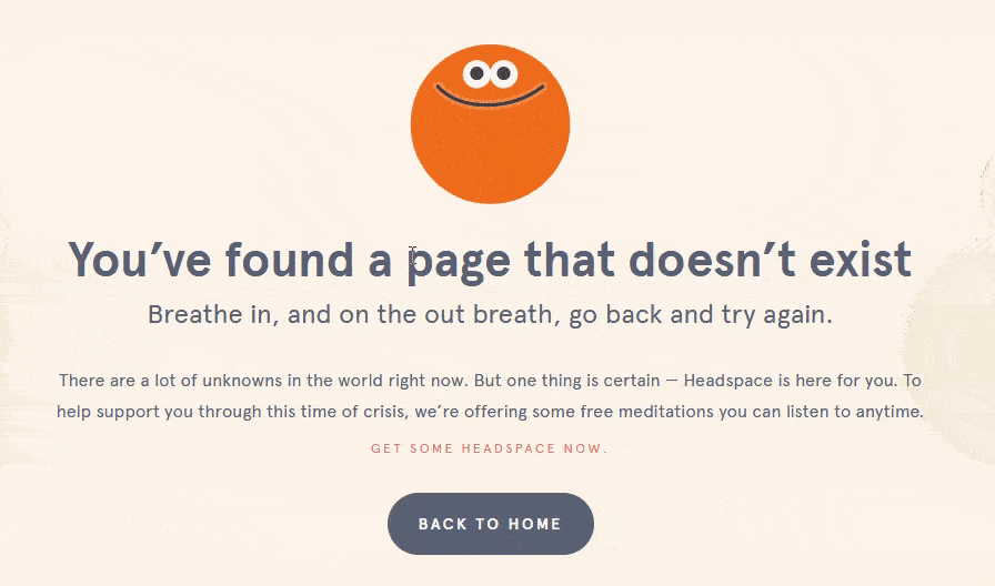
Headspace is a big name in online meditation services. They understand the human’s brain and thus its 404 error page only depicts the purpose of the page correctly. But it also is in line with the product and what it can do i.e. to calm the users from stress. The character itself has a slow and rhythmic movement that a lost visitor can see for some time and get some headspace.
It tells the user to breathe in and out to get relief from stress. This is a great way to demonstrate your brand and its working through a 404 page.
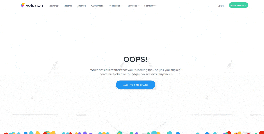
Volusion is a cloud-based e-commerce software that online merchants can use for developing an e-commerce store, add products, payment details and start selling. The colourful balls on the 404 error page of Volusion made it to the list which captivates a lost visitor.
The colour combination is of the Volusion logo and the neat page after the balls fall shows the homepage link with 404 characters in the background.
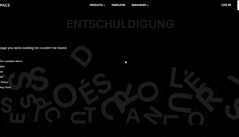
Squarespace is a website builder on which users can build and host a website. Users can use pre-built templates drag-and-drop functionality to design web pages. On its 404 error page, there is an alphabets game that users can enjoy. Users can move alphabets with the cursor. Users who don’t have any interest in the game can simply redirect to the links provided on the page.
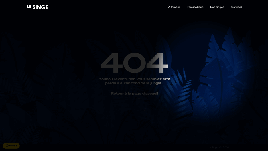
Last, but not least; Le SINGE has an amazing concept of the 404 pages immediately sells them for what they do. 404 is depicted with darkness and as your cursor moves, the spotlight is thrown in that part of the screen (they say jungle!)
The lost visitor can either directly use the links on the 404 page or initiate the chat with their support team from the page itself!
Wrapping Up:
In this article, we have gone through several examples of the best creative 404 pages alike which you can develop on your e-commerce store. At Ceymox Technologies, the best e-commerce development company in India, we are having expertise in developing highly attractive e-commerce stores with custom designs. Let us know your requirements.
 Hubspot SEO Certified |  Hubspot SEO II Certified |  Google Ads Search Certified |  Google Analytics Certified |
Sreehari N Kartha is a skilled Digital Marketing Analyst at Ceymox, certified in SEO. His expertise encompasses a wide range of digital marketing strategies, including managing advertising campaigns on platforms like Google Ads, Facebook Ads, Instagram Ads, WhatsApp Ads, and LinkedIn Ads. With a strong foundation in SEO and SMM, Sreehari is adept at optimizing online visibility, driving engagement, and generating qualified leads and conversions. His passion for emerging technologies, such as Crypto, NFTs, and Web3, further complements his skillset, enabling him to navigate the dynamic digital landscape.
View All Articles