Shopping Cart page is the penultimate page of the customer journey. This page is just before the checkout page or payment page. On this page, the customer checks the total cost of the order, along with the order details, and can also apply any promotional code or discount code. Most importantly, this is the page where the customer makes the actual decision of buying.
Apart from the order overview, it is a very important page for showing purchase information that can weigh in the purchase decision. On this page, you can also find some related products which the customer may find relevant for increasing the average cart value.
Shopping cart pages usually have high abandonment rates. Customers can face many issues on the cart page and don’t proceed further or leave without purchasing. To reduce this abandonment rate and increase the sales in your Magento store, continue reading this article. In this article, we will be knowing different strategies for designing an optimal Magento Store Cart Page. Let’s begin…
Magento Carts:
There are two different types of carts in Magento. The first cart is “mini cart” while the other cart page is a “Full Cart” page. Both these pages have different purposes but also have some similarities.
1. Mini Cart:
Min Cart or Drop-down cart of Magento gives a quick overview of the products which have been added into the cart. The trigger for this cart is placed within the main header. It is available throughout the site, regardless of the page user is currently on.
Many e-commerce stores don’t go for this type of functionality. Generally, when the user clicks on the cart button, they get landed to the cart page of the website. But a mini-cart is also a very handy feature. When the users need to remind themselves of what they have already added in the cart, they need to frequently check the cart. For this, it is very useful. It is mostly required in grocery stores, daily needs stores, where the customers can check whether they have added products to their bucket list or not.
It can also act as a feedback signal once the customer adds any product in the cart. Instead of cluttering the interface design with success messages (or modals) that confirm a successful cart addition, you can simply trigger the mini-cart to show!
Apart from showing products in the cart, the mini-cart should also provide the way to use to reach the full cart details page. You can also include a payment or checkout page so that the users can directly checkout as well.
Product manipulation is also possible with mini-cart functionality. Just like the cart page, the customer would be able to edit or configure the products.
2. Cart Page:
The cart page of Magento provides the summary of the order and the last chance to review the order before the checkout process.
Generally, the customers prefer to scan the page while reading it in detail. Hence, the cart page should be scannable and clear. But the most common issue on the cart page is that they are visually cluttered rather than providing clear and straightforward layouts.
There are many contents on the cart page which can distract the customers from the main attention point i.e. click on the main checkout button. If you are adding content which is not so necessary always remember that it shouldn’t be overwhelming. Check whether they are promotional banners, three rows of “customers also bought”, or real customer reviews are actually necessary or not.
After encountering so many items, the customers may feel overwhelmed. They can feel like ads which are disrupting their shopping experience. Remember, the main purpose of the cart page is to push customers forward to the checkout page. Hence, lesser the distracting things, it would be better.
But what is necessary on the Cart Page?
1. Products Overview:
The images of the products in the cart should be like the product details page i.e. of high quality with detailed product summary. Showcase the attributes chosen by the customer such as size, quantity, etc. It is highly important when the thumbnail is the same for different products with their configurations. Customers always prefer to check whether they are buying the right product or not.
If there are configurable products in the cart, then always provide the edit button. Don’t compel the customers to first remove the product from the cart, and then add the item again with a different attribute.
Also, include an option of manipulating the quantity of the product. Even if your customers mostly buy a single product, there’s still a chance that the customer will want to order more. Having an option to increase (or decrease) quantity in the cart is much easier than returning to the product page and adding the same product to the cart.
2. Shopping Cart:
Shipping fees & Return policy:
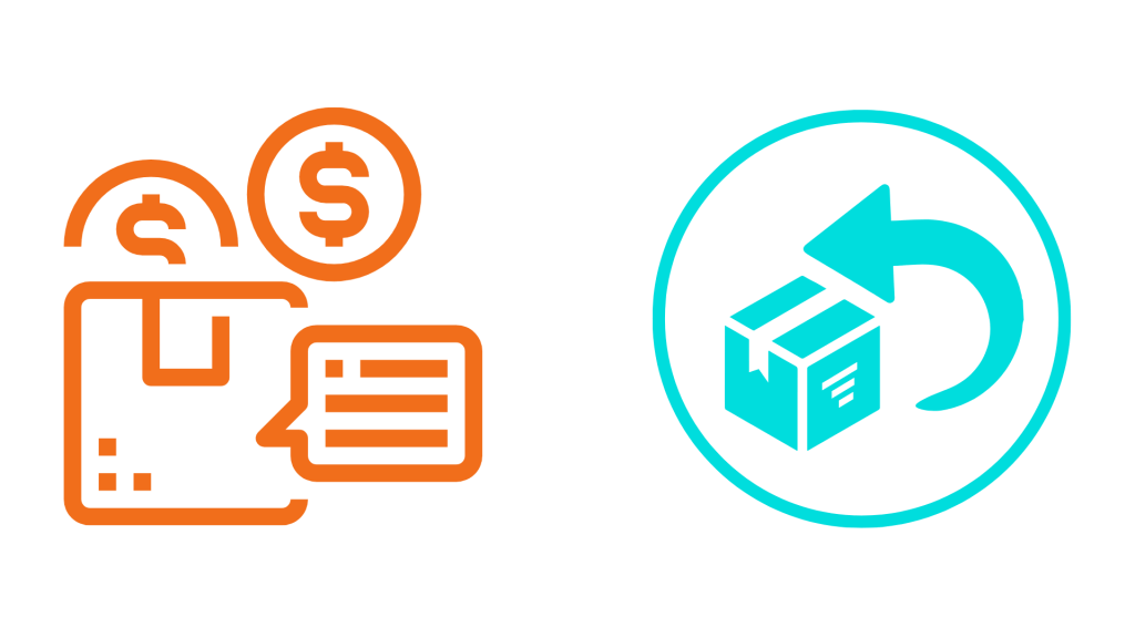
Magento offers a shipping calculator on the cart page which enables the customers to quickly check the shipping cost and decide whether they want to proceed with the purchase or not. It is worth mentioning that shipping always plays a major role in making the purchasing decision. When the shipping costs are not favourable, then the users may leave the cart. It is always better to inform the users about shipping before they reach the final page. You don’t want to surprise them with additional fees once they’ve already made a purchase decision.
Even if you are using any shipping calculator, provide the shipping costs on the shopping cart page. It will help in eliminating any negative surprise to the customers of any added costs at the checkout page, thus reducing the cart abandonment rate.
Also, provide return information as well. If someone is buying a product with uncertainty, then the return information will play a significant role in decision making than the shipping cost.
Trust Seals:
People wish to feel safe during online shopping. Trust Seals can help in this. These are the small symbols which show that your store is fully secured and reliable. You can see them in many different forms or shapes, however primarily they are of two types.
First type: Related to 3rd party vendors i.e. they get certification from some security specialized companies. When you get certified then you can add that badge on your store. Customers can easily verify the authenticity just by clicking on that badge which will redirect to that 3rd party site.
Second type: In this type, you can showcase the unique selling points of your e-commerce store. It can be anything such as free shipping, 30-days returns, money-back guarantee, etc. It can get attraction from the users that you provide additional value to them.
Clear button hierarchy:
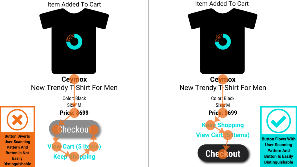
On the basis of content, the button on the cart pages can be different for different actions such as updating, applying, editing, etc. But you should make sure that the checkout button is easily distinguishable from other buttons. Having visually similar buttons can create confusion to the users, and they may accidentally press a wrong button which can be a poor user experience.
3. Additional Content on the Cart Page:
Options of Coupon Code:

Since the past few years, coupon codes have become an important marketing tool. But they also come with several issues. Many customers see the option of coupon code, but don’t have any. For this purpose, they thought to leave the site at that time and will come back with a code, but hardly anyone comes. This can result in a higher cart abandonment rate.
If you are including the option of coupon code in your site, don’t highlight it to avoid any such scenario. The direct approach is to hide the coupon code behind a text link (e.g., “Have a coupon code?”) which will open the actual field on the customer click.
Cross-Sells:
Cross-Selling is a very popular strategy for selling products. Here you show the related products which customers are buying. The products can be of any category but must be complementary to each other for e.g. A room freshener refill for an automatic room freshener. Cross-selling can be a very important factor for increasing your sales. In 2006, Jeff Bezos revealed that 35% of sales on Amazon is through cross-selling. The cross-sells should not appear in cart, but rather the product pages. Remember that cross-selling aims for the final impulse purchase. You don’t want customers rethinking their purchase decisions which can result in cart abandonment. Hence, be careful of what you are offering on the cart page.
Wrapping Up:
In this article, we have learnt a few methods that we can adopt while designing the cart page for reducing the cart abandonment rate. E-commerce has become a very competitive industry and we can’t let a single button deteriorate the shopping experience in our store. At Ceymox Technologies, the best Magento development company in India, we are having expertise in developing top-notch e-commerce stores. Please let us know your requirements.
 Hubspot SEO Certified |  Hubspot SEO II Certified |  Google Ads Search Certified |  Google Analytics Certified |
Sreehari N Kartha is a skilled Digital Marketing Analyst at Ceymox, certified in SEO. His expertise encompasses a wide range of digital marketing strategies, including managing advertising campaigns on platforms like Google Ads, Facebook Ads, Instagram Ads, WhatsApp Ads, and LinkedIn Ads. With a strong foundation in SEO and SMM, Sreehari is adept at optimizing online visibility, driving engagement, and generating qualified leads and conversions. His passion for emerging technologies, such as Crypto, NFTs, and Web3, further complements his skillset, enabling him to navigate the dynamic digital landscape.
View All Articles