There is a bigger role of the Product page in defining the success of your e-commerce than you may think. Understanding the basic of the Magento product page design will help you utilize the Magento platform to the fullest. Whether you want to design a landing page in Magento, looking for a reference for product listing page design, or want to create a product details page design, we will be covering all. In this article, we will be mentioning all the important aspects along with real-life examples from high conversion e-commerce stores.
7 Product Page Design Principles for Boosting Your E-commerce Sales:
1. Consider Target Audience while Design:
Considering the buyer persona of your patrons will be great while design the user interface of your site. Designing the product page focusing on your target audience can increase efficiency to a great extent and create a positive shopping experience.
2. Maintain Consistency:
The next major principle is ensuring that you are maintaining the consistency of your brand across your store. Beginning from the landing and ending at the Order confirmation page, the page layout design should be consistent with the theme, colours, and other attributes of your brand. This will make the website more reliable and trustworthy.
3. Make it Simple:
Although a captivating design attracts an audience still the customers are focused on your offerings and what services you provide. Putting efforts for simplicity in the e-commerce product listing page allows the product information to shine and customers can make more focused and distraction-free decisions.
4. Use Website Copy that Sells:
Customizing your website copy to speak to your visitors is crucial while you are selling online. A long and tedious promotional writing will fail. Being short & sweet when you are talking business will easily put the message in customers’ heads without any fluff.
5. Don’t Fear Conventions:
Following conventions will reduce the learning curve for first-time customers by helping them orient themselves more quickly on your website. Using standard practices of site navigation, search functionality, and website structure will create a similar buying experience.
6. Create an Iterative Process:
A converting product page design is that which can evolve as per the demand of its target audience. Regular testing will let the store owners know about vital insights into their website performance. These insights will help them make decisions to create an iterative process to improve the website design and enhance UX.
7. Adopt a Responsive Design Approach:
The mobile audience comprises the major pie of the target audience, thus you must make sure that the product page design or in fact the whole website is mobile responsive and suitable for the audience using different devices.
Essential Product Page Design Elements:
There are some elements that you must include in the design of your product page. These are:
1. Clear Navigation of Your Product Page:
Showing breadcrumbs on the pages of your store will help the users to easily navigate or switch between pages. The back button of the browser allows a user to get back one page at a time. But the breadcrumbs navigation allows going on other pages directly.
2. Reviews and Ratings of Products:
Displaying reviews and ratings of products will build trust among the customers. When customers see that the product they are considering has already been used by other customers and it was value for money for them, then it motivates them to make a successful purchase.
3. High-Quality Product Media:
In many cases product pages are responsible for the returns. It is common in e-commerce that the products are very attractive when seen online but are dull in actuality. Thus, you must always use the best quality images and videos and placing them above all the necessary information will help customers to visualize what they are buying. Use multiple product images, and give the functionality of zoom whenever the customers hover on the image.
4. Highlighted Display of Costs and Availability:
If the customers are being forced to add a product to the cart to know its pricing will be a bad experience. The product page should be designed to properly display the availability, pricing, and other applicable costs such as shipping. Doing this will help the customers have oversight of how much the item actually costs.
5. Selection of Product Options:
There are different types of product options in Magento such as Simple, Configurable, Grouped, Bundled, etc. You can display these different product options to showcase all variants clearly and provide your customers with a user-friendly way of selecting any product option on offer and customize the product before purchase.
6. “Add To Cart” Button:
Make a distinguishable CTA of Add To Cart button which customers can easily find and click to add the product into the cart. Make sure it’s located above the fold on the desktop page, stickied on the mobile view, and is a unique colour.
7. Customer Engagement Opportunities:
You can use social share buttons by which the customers can share the product on social media platforms or with their kith and kin. It will boost website traffic and increase customer engagement.
Common Mistakes in the Product Page Design:
Here are some pitfalls that you must avoid while designing a product page on your Magento store:
1. Inadequate Product Information:
There is a different practice in online shopping in comparison to brick-and-mortar stores. The customers can’t touch or feel the products but instead, rely on the information that you have provided in the product description. The customers check the product description, images, videos, visuals, reviews & ratings, etc. In many scenarios, even if the high-resolution images are not as per the actual product, then the customer will prefer to return.
2. Lack of Social Proof:
Social proof is a reliable & effective ally for e-commerce businesses, which can increase trust, & awareness of your brand among the customers and convert them into regular patrons. A huge appeal of a product by a lot of consumers boosts its demand. Social proof in e-commerce validates the choice. It assures the customers that the product is a value for money, by showcasing the experience of others as proof.
3. Missing Add To Cart Confirmation:
When the customers add a product into the cart, a notification should be given by which the customers know that product has been added. Without this, customers may add a product multiple times or abandon the site entirely. Displaying a success message in the popup can help customers to avoid confusion.
Product Page Design Stages:
There are 6 stages to follow while designing a product page:
Idea Validation -> Wireframing -> Prototyping -> Testing -> Launch -> Post Launch
1. Idea Validation:
The first stage in product page design is conceptualizing and visualizing the design of your page. It also includes accumulating information, mentioning the scope of the project, and outlining the measures of success.
2. Wireframing:
After having a clear concept and a detailed scope of the product page, the next stage involves creating the layout of the Magento product page without any final design elements. This “wireframe” creates the structural foundation for the functionality and content of the landing page.
3. Prototyping:
In this stage, you will be building a prototype or the first document to validate its design. At this stage, the design will become tangible from the concept form so that the designers can make refinements or any required changes.
4. Testing:
After prototype creation, there will be a testing phase for making sure that the loads and functions are as per the expectations on all browsers and screens. Most importantly, it identifies any existing or potential bugs in the design or functionality before deploying it to the production environment.
5. Launch:
After thoroughly checking the website, it will become ready for launch. In the launch stage, the design will be transferred to the live server and final diagnostics will be performed to make sure everything is up to place.
6. Post-launch:
The process doesn’t terminate at the launch. After transferring the design to the liver, unforeseen issues may still pop up. The post-launch phase involves squashing bugs and polishing up rough edges. Occasionally, it may also include making minor changes to the UI or UX based on customer feedback.
Real-Life Examples of Best Product Pages:
After you have known the concept of product page designs along with their do’s and don’ts, let’s look at some best examples of high conversion landing pages:
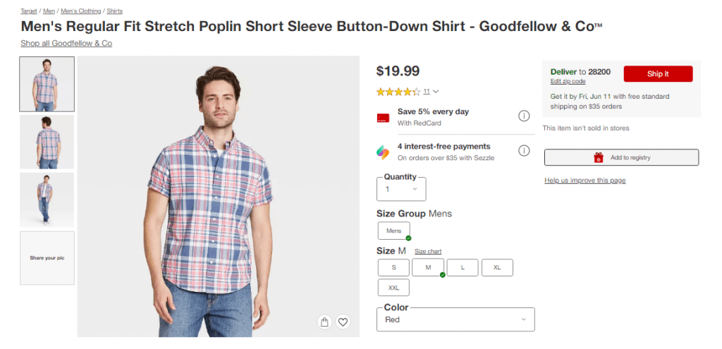
Target is a very popular clothing brand with a stupendous product page design. No doubt that the company is having high conversion rates as their product page has everything a customer requires for a buying decision i.e.:
- Breadcrumbs
- Prominent Price
- High-quality images
- Delivery information
- CTA
- Shipping & Returns information
- Product information
- Recommendations
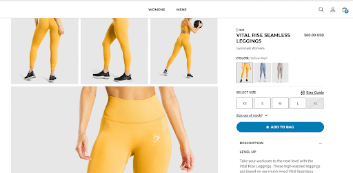
Gymshark is a popular gym items brand that mostly deals in workout clothing. They focus on the high-quality images of their products which their customers can check wisely. The other important elements of their product page are:
- Breadcrumbs
- Price + Discount
- Visual Swatches
- High-quality images
- Delivery information
- Recommendations
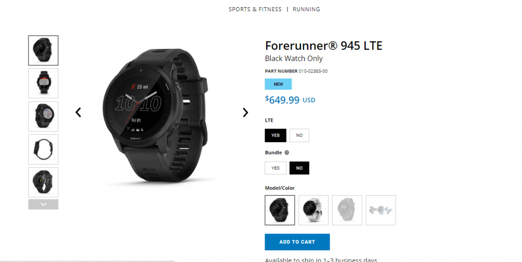
Garmin, a popular watch brand gives a clean layout of the product page to its customers. The customers can choose from the various options on the page as per their needs. The other elements are:
- Price
- High-quality images
- Product Options
- Customization Options
- CTA
- Shipping information
- Product information
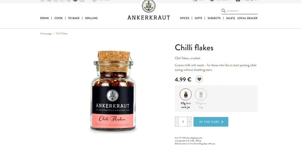
Germany based brand, Ankerkraut is a prominent name in the spice industry. The product pages focus on highlighting the offering. For a user-friendly experience, they use the following elements:
- Breadcrumbs
- Price
- Best-quality images
- Image swatches
- CTA
- Product information
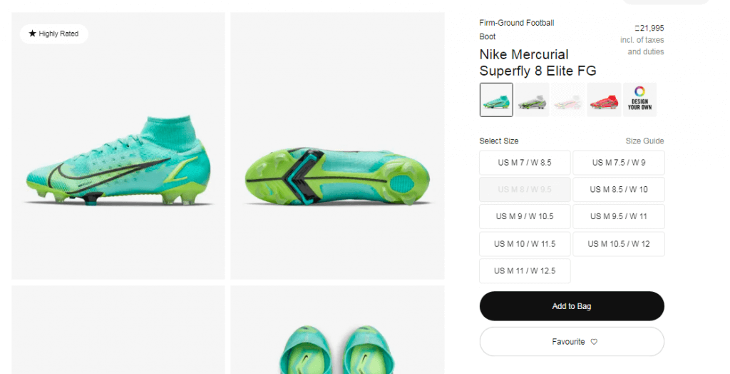
A prominent shoe brand, Nike uses a minimalistic design with high-quality images and visual swatches to create a distraction-free product page. The company uses the following elements in their product pages:
- Pricing
- Image Swatches
- CTA
- Product information
- Shipping & returns info.
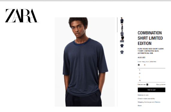
Zara, a highly reputed name in the fashion industry, keeps all product information and images above the fold to help customers make their buying decisions quickly. The elements used by Zara are:
- Price
- Description
- CTA
- Product options
- High-quality images
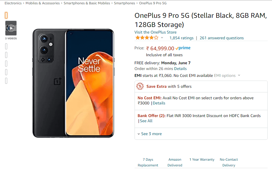
One of the most popular brands in the e-commerce industry, Amazon provides a very detail-oriented product page with many elements which satiate a customer.
- Product details
- Breadcrumbs
- High-quality images
- Shipping and Return details
- Reviews and Ratings
- Frequently Bought items
Wrapping Up:
In this article, we have understood the value of a product page design and the ways of how to create an effective product page design that converts. At Ceymox Technologies, the best Magento development company in India, we follow the best design principles just not to attract customers but to increase sales. Let us know your requirements.
 Hubspot SEO Certified |  Hubspot SEO II Certified |  Google Ads Search Certified |  Google Analytics Certified |
Sreehari N Kartha is a skilled Digital Marketing Analyst at Ceymox, certified in SEO. His expertise encompasses a wide range of digital marketing strategies, including managing advertising campaigns on platforms like Google Ads, Facebook Ads, Instagram Ads, WhatsApp Ads, and LinkedIn Ads. With a strong foundation in SEO and SMM, Sreehari is adept at optimizing online visibility, driving engagement, and generating qualified leads and conversions. His passion for emerging technologies, such as Crypto, NFTs, and Web3, further complements his skillset, enabling him to navigate the dynamic digital landscape.
View All Articles